Reconciling the relationship between user and phone.
Role: UX Designer
Duration: 3 weeks+
Challenge: Collaborative project to develop an application that solves a real world problem. We focused on mindfulness and making our phones work for us instead of against us.
Responsibilities: Design Research, Visual Design, Prototyping
How can we reconcile the user's relationship with their phone?
Through user research we recognized a resounding pattern amongst users - they had very complicated relationships with their phones.
We began to brainstorm potential resolutions for this problem. How could we help our users use their phones in a more productive manner and encourage positive mental health habits?
The Problem:
User research revealed some key issues users experienced in regard to their cell phones:
→ Users felt that their social media consumption had negative impacts on their life
→ Users began to use their phones immediately upon waking until bedtime
→ Heaviest usage is at night before bed
Our Approach:
As a small design team, we utilized an agile framework to meet a tight deadline. We developed the onboarding and basic concept for the mobile IOS app.
research + user interviews
✹
research + user interviews ✹
Out of 23 people who filled out our survey, 61% said that their device usage affected their daily routine negatively.
When asked what resources they use to practice mindfulness, users were given multiple choice options to choose from with the ability to fill in their own answer.
39% of answers were meditation, and 32% mentioned journaling.
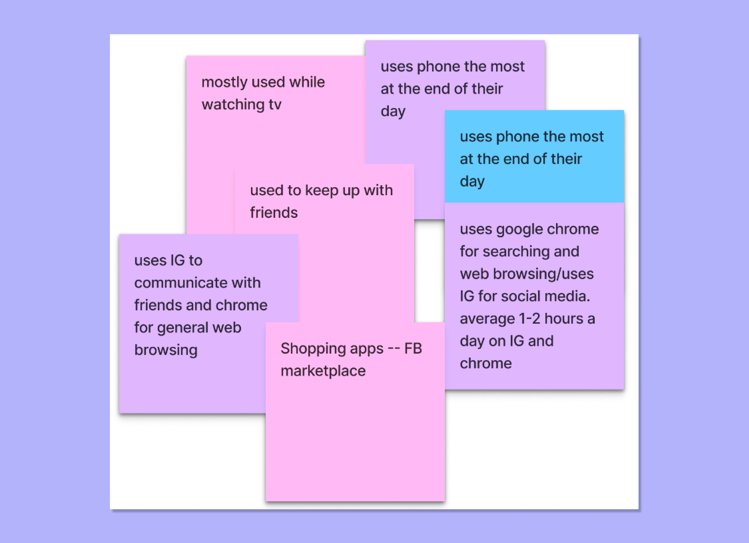
As a team we compiled the research data into an affinity map to recognize correlating themes amongst our users.
This is an excerpt of the most recurring themes in our data.
From our data we were able to solidify our user persona and moved forward with a competitor analysis.
Looking at our direct and indirect competitors we were able to see what features users loved, hoped for, and the shortcomings of other apps in the market.
We wanted to determine if the features we were thinking of would address the needs of users seeking this type of application and how we could stand out from our competitors.
→ Accessible pricing was a big concern for a lot of our competitors' users.
→ Encouraging habit forming moves users towards long-term success and usage of the app.
→ Accountability helps users stay motivated and fosters community.
value proposition
✹
value proposition ✹
We understand that our users are not going to stop using social media all together. Our goal is to reconcile the user's relationship with their phone to improve their lives and overall well-being as much as we can within the app.
"MindFlow, let’s have a great day together."
Before jumping into wireframing, we mapped out a user journey to position how MindFlow will solve our users' problems.
lo-fi & usability testing
✹
lo-fi & usability testing ✹
From our sketches, we moved into lo-fi wireframing and prototyping.
We changed some language in the wireframing to create a more welcoming environment to our users and guide them through the dashboard more clearly.
Our lo-fi prototype was used for usability testing where we had users complete three tasks.
hi-fi prototyping
✹
hi-fi prototyping ✹
Considering our user feedback and test results, we made final iterations to the structure of the wireframes and started creating our hi-fi prototype.
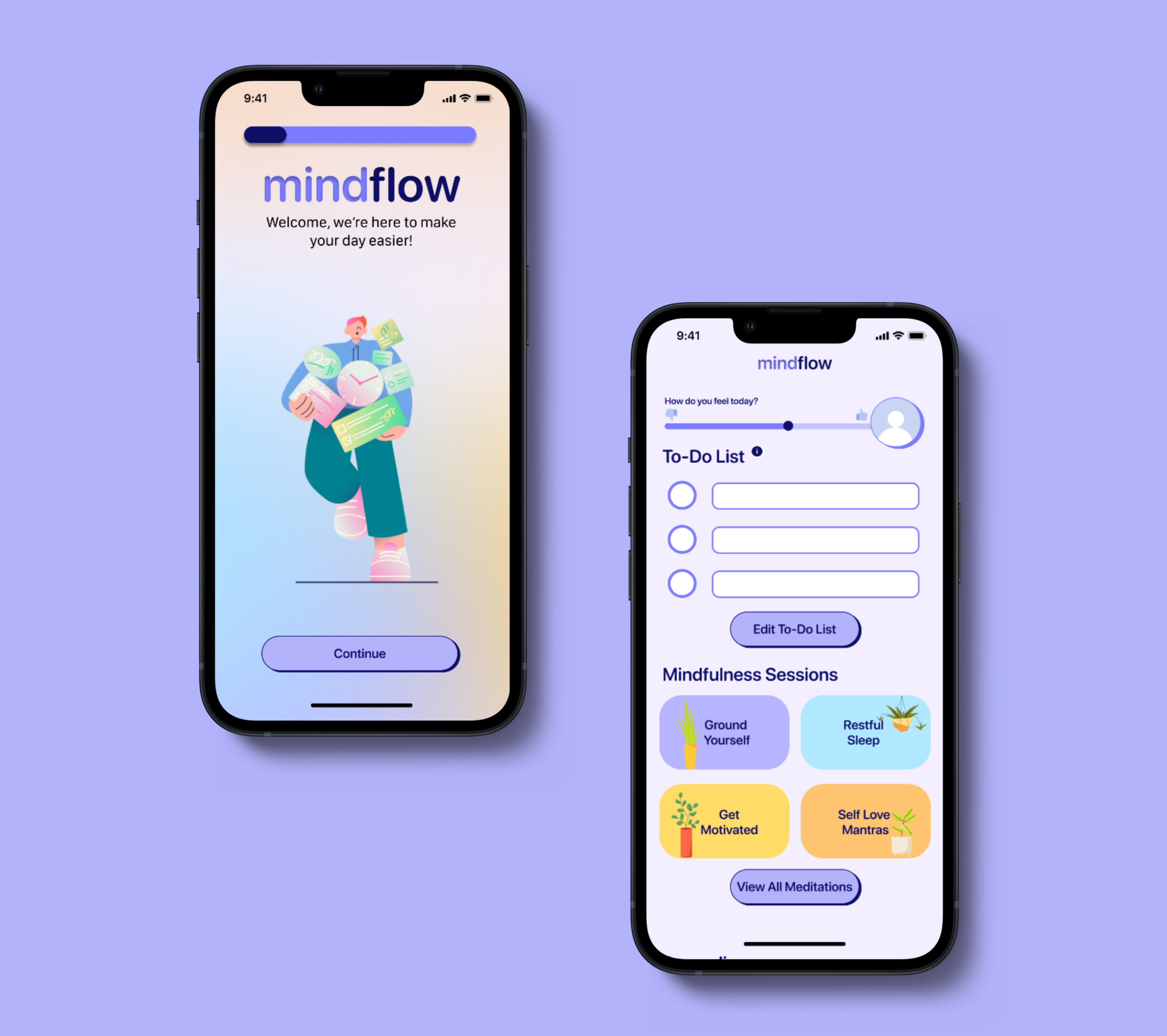
We wanted the UI to be bright and welcoming while still being peaceful. Since our goal is to help our users create a healthy relationship with their phones, we opted to not implement any gamification aspects and instead focused on mindfulness and reframing the users' concepts of productivity.
Allowing users to add their own tasks in "bite-sized" lists aims to encourage users to make attainable goals and form healthy habits.
Instead of trying to remove the user from their phone entirely, we created a space for the user to turn to when they feel anxious, stressed, or just need to set some attainable goals for their day.
Overall, MindFlow aims to reconcile the relationship between the user and their phone by making their phones work for them rather than against them. Moving forward, we would like to incorporate the ability to reflect on past journal entries and add the ability to send your future self a love note. We also would love to incorporate a simple social aspect that would allow users to send short encouraging messages to other users.


